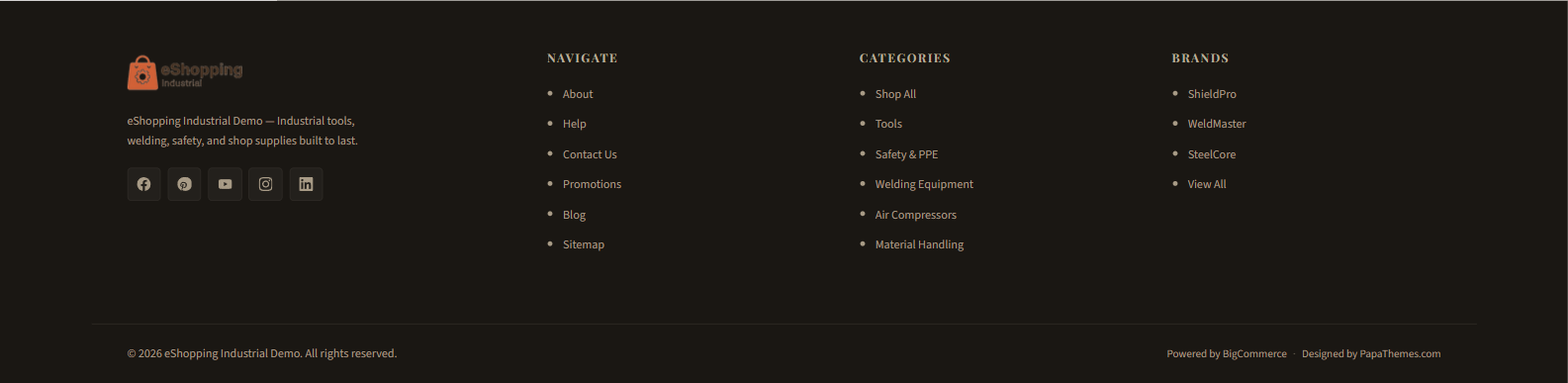
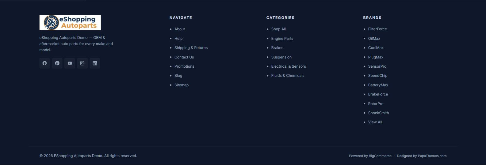
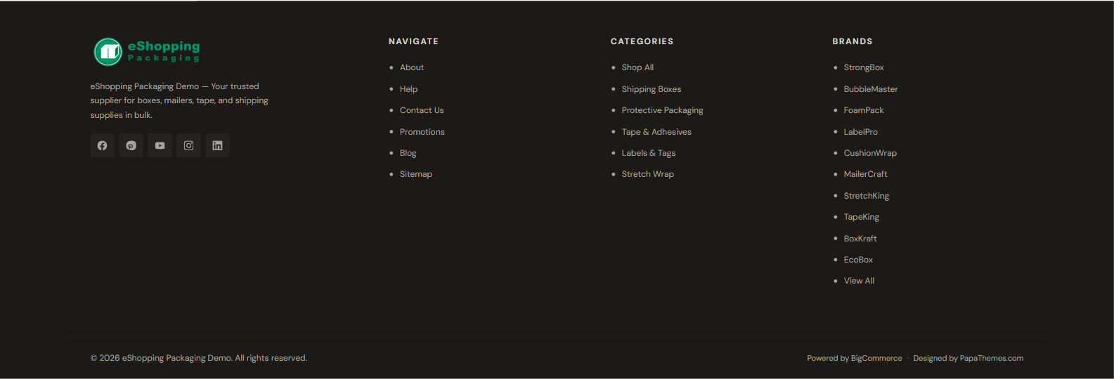
Footer
The eShopping footer is built into the theme and has these areas:
- Brand block — your logo, a tagline widget, and (optionally) social icons (left column).
- Navigate column — your Storefront Web Pages, plus an automatic Sitemap link.
- Categories column — your store's top-level categories.
- Brands column — your shop-by-brand list (can be turned off; see ③).
- Bottom bar — copyright line, payment-method icons, and the Powered-by / Designed-by credit.
The three link columns (Navigate, Categories, Brands) are generated automatically from your store — they are not hand-built link menus and there is no "Footer menu" to configure.
① The brand block
The brand block shows your store logo, a tagline area, and (optionally) your social icons.
Footer tagline (widget)
The tagline area is a global widget region (eshopping_footer_description--global). The theme no longer ships a hardcoded tagline — the footer template renders this region raw, so it is empty until you drop a widget into it. On all four demo stores the tagline is an AI HTML Generator | PapaThemes widget. See the Widget regions reference for the full list of regions.
.papathemes-ai-widget-… { … }
…your HTML…
</style>
To add or edit it:
- Open Page Builder (Storefront → My Themes → Customize). Scroll down to the footer — the first column shows a dashed widget-region outline.
- If empty, click the + button inside that outline and drag in an AI HTML Generator | PapaThemes widget (this drops it into the
eshopping_footer_description--globalregion). This widget is provided by the PapaThemes app, which must be installed. If a widget is already there, just click it. - Edit the HTML Content field. The live tagline is simply a
<span class="eshopping-footer-desc-text">…</span>:
<span class="eshopping-footer-desc-text">Your store tagline — what you sell and why customers trust you.</span>
Optionally follow it with a <ul class="eshopping-footer-trust"> list of icon + text trust items (the theme styles this list — icon-and-text rows in the footer text color):
<span class="eshopping-footer-desc-text">Your store tagline goes here.</span>
<ul class="eshopping-footer-trust">
  <li><svg><use xlink:href="#icon-truck"></use></svg> Same-day shipping</li>
  <li><svg><use xlink:href="#icon-shield"></use></svg> Secure checkout</li>
</ul>
- Click Save.
The theme styles the .eshopping-footer-desc wrapper (font, color, max-width) and the optional .eshopping-footer-trust list. The .eshopping-footer-desc-text span inherits the wrapper styling.
Exact demo tagline HTML (current, per store) — none of the four currently uses a trust list:
Exact demo HTML — all 4 stores
Industrial:
<span class="eshopping-footer-desc-text">eShopping Industrial Demo — Industrial tools, welding, safety, and shop supplies built to last.</span>
Auto Parts:
<span class="eshopping-footer-desc-text">eShopping Autoparts Demo — OEM & aftermarket auto parts for every make and model.</span>
Electronics:
<span class="eshopping-footer-desc-text">eShopping Electronics Demo — Laptops, monitors, audio gear, and smart home tech — tested for quality and shipped fast.</span>
Packaging:
Social icons
Social icons render in the brand block only when the Footer Placement toggle is enabled under Theme Editor → Header and footer → Social media icons. The icons themselves come from the accounts you fill in at Storefront → Social media accounts.
Supported networks: Facebook, Instagram, X (Twitter), LinkedIn, YouTube, Pinterest, Tumblr, Google+, and RSS.
② The Navigate and Categories columns
These two columns are filled in automatically — there is nothing to wire up in a menu:
- Navigate — lists your Storefront → Web Pages (e.g. About Us, Privacy Policy, Returns, Shipping), and always ends with an automatic Sitemap link.
- Categories — lists your store's top-level categories.
To change what appears in the Navigate column, add, remove, or reorder your Storefront Web Pages. To change the Categories column, edit your category tree.
③ The Brands column
The third link column is titled Brands. It lists your shop-by-brand brands and ends with a View All link. Configure it in Theme Editor → Header and footer:
Note
The Brands column hides automatically if Show brands in footer is off or your store has no brands.
The brand list itself is generated from your store's brands (Products → Brands in the BigCommerce admin) — it is not a hand-built menu.
④ The bottom bar
The bottom bar holds the copyright line, the payment-method icons, and the Powered-by / Designed-by credit. Each part has its own on/off control.
| Setting | Effect | Where |
|---|---|---|
| Store name | Appears in the copyright line | Settings → Store profile → Store name |
| Show Copyright Footer | Shows / hides the copyright line | Theme Editor → Header and footer |
| Show Powered By | Shows / hides the Powered-by / Designed-by line | Theme Editor → Header and footer |
| Payment-method icons | One toggle per provider | Theme Editor → Header and footer |
Copyright line. When Show Copyright Footer is on, the line reads:
© {year} {Store name}. All rights reserved.
Powered-by / Designed-by line. When Show Powered By is on, the line reads:
Powered by BigCommerce · Designed by PapaThemes.com
This whole line is controlled by the single Show Powered By toggle — turning it off hides both the BigCommerce and the PapaThemes credits together.
Payment-method icons. Each provider has its own toggle under Theme Editor → Header and footer → Payment icons. The defaults are:
| Provider | Field label | Setting id | Default |
|---|---|---|---|
| American Express | Show American Express | show_accept_amex |
On |
| Discover | Show Discover | show_accept_discover |
On |
| Mastercard | Show Mastercard | show_accept_mastercard |
On |
| PayPal | Show PayPal | show_accept_paypal |
On |
| Visa | Show Visa | show_accept_visa |
On |
| Amazon Pay | Show Amazon Pay | show_accept_amazonpay |
Off |
| Google Pay | Show Google Pay | show_accept_googlepay |
Off |
| Klarna | Show Klarna | show_accept_klarna |
Off |
Footer colors
Set footer colors in Theme Editor → eShopping Theme → Footer. Each is a color picker:
| Field label | Setting id |
|---|---|
| Footer Background | eshopping-footer-bg |
| Footer Text | eshopping-footer-color |
| Footer Heading | eshopping-footer-heading |
| Footer Link | eshopping-footer-link |
| Footer Link Hover | eshopping-footer-link-hover |
| Footer Border | eshopping-footer-border |
The real defaults vary per variation:
| Setting | Industrial (default) | AutoParts | Electronics | Packaging |
|---|---|---|---|---|
| Footer Background | #1a1713 |
#0f172a |
#18181b |
#1c1917 |
| Footer Text | #a89b86 |
#94a3b8 |
#a1a1aa |
#a8a29e |
| Footer Heading | #b8ad9b |
#cbd5e1 |
#d4d4d8 |
#d6d3d1 |
| Footer Link | #a89b86 |
#94a3b8 |
#a1a1aa |
#a8a29e |
| Footer Link Hover | #faf8f4 |
#f8fafc |
#fafafa |
#fafaf9 |
| Footer Border | #2e2a25 |
#1e293b |
#27272a |
#292524 |
You can override any of these after picking your variation.