Header & Top Bar
The eShopping header has three stacked strips:
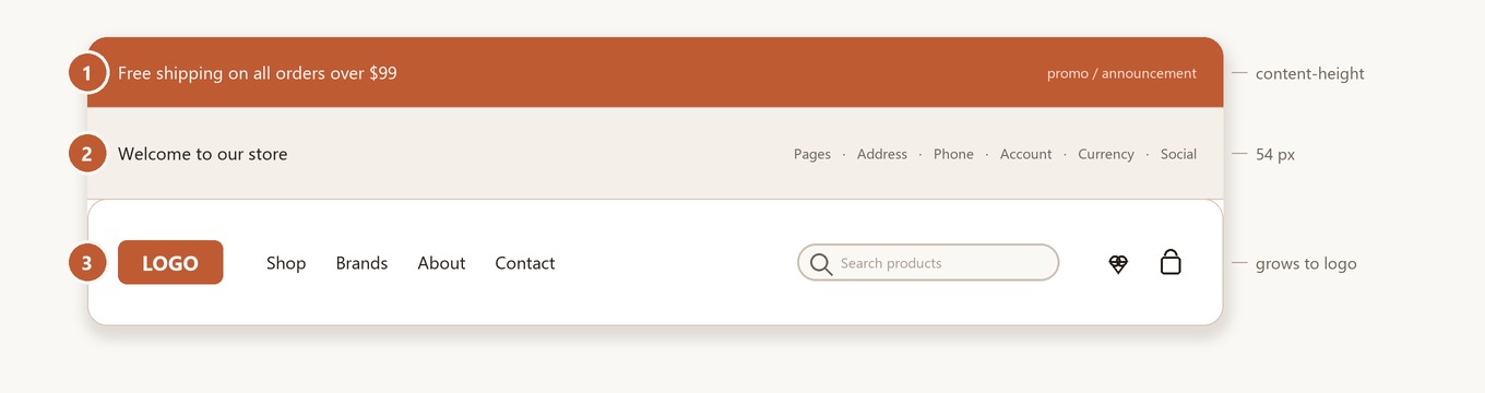
Each strip is configured independently.
① Top Banner (the promo strip above the header)
This is the BigCommerce native banner — not a Page Builder widget region. It's managed in:
Marketing → Banners (in your BigCommerce admin sidebar — outside Page Builder).

Create a banner
- Marketing → Banners → Create a banner.
- Configure:
- Name — internal label.
- Banner content — paste HTML (use the snippet below).
- Show this banner on — Top of all pages.
- Visibility — Show.
- Date range — optional schedule.
- Save.
The theme renders whatever HTML you paste — it adds no carousel, rotation, or fixed height. The strip is only as tall as your banner content.
Banner colors
Snippet — single message
Snippet — message with a phone link
<div style="text-align:center">
  Free shipping on orders over $99 ·
  Customer service: <a href="tel:+18001234567">+1 (800) 123-4567</a>
</div>
If you want the banner to rotate between several promos, use a Page Builder banner widget or a third-party carousel app — the theme itself displays the banner HTML as-is.
② Top Bar (welcome text + utility links)
The 54 px strip showing the welcome text, web-page links and address on the left, and account links, currency selector, phone and social icons on the right. Configure colors and toggles in Theme Editor → eShopping → Header:

The store address and phone values shown by the two toggles come from your BigCommerce admin, not the theme:
Social icons display automatically
Social icons appear whenever you have at least one social URL set under Storefront → Social media in your BigCommerce admin. The Show Social Icons toggle currently has no effect in the template — the icons are driven only by whether social URLs exist. Supported networks: Facebook, Instagram, X (Twitter), LinkedIn, YouTube, Pinterest, Tumblr, Google+, RSS.
Welcome text fallback
If you leave Welcome Text empty, the top bar shows the default greeting "Welcome to {store name}" — it does not hide the area.
Topbar / Nav pages range
Both Topbar Pages Range and Nav Pages Range (in the Main Nav, below) take a from,to index pair, not a list of page numbers:
- The value is two zero-based indexes separated by a comma, e.g.
6,8or0,6. - It shows web pages whose index is ≥ from and < to (the end index is exclusive).
- Defaults: Topbar Pages Range =
6,8and Nav Pages Range =0,6. - Leaving the field empty does not show all pages — both
fromandtofall back to0, so nothing is shown.
So 0,6 shows the first six web pages (indexes 0–5) in the nav, while 6,8 shows the next two (indexes 6–7) in the top bar.
Logo
The logo lives in the Main Nav strip (③), not the top bar. Configure it in Theme Editor → Header and footer → Logo (standard BigCommerce controls):
- Upload your logo file (transparent PNG recommended).
- Logo size — Optimized for theme (250x100) / Original (as uploaded) / Specify dimensions.
- Logo position — Left / Center / Right.
The Main Nav height is not fixed — it grows to fit your logo height (a minimum of 52 px, otherwise the logo height plus padding), so taller logos are not clipped.
③ Main Nav (logo + pages + search + cart)
The sticky strip containing the logo, web-page navigation, search box, and wishlist / cart icons. Configure colors and page range in Theme Editor → eShopping → Header (there is no separate "Nav" heading — the navigation color settings sit under the Header heading alongside the top bar):

The web pages themselves come from your BigCommerce admin, not the theme:
The nav lists your web pages (filtered by the Nav Pages Range). A web page that has child pages becomes a dropdown — its children are listed when you hover or open it with the keyboard. The nav does not render storefront categories; categories live in the Sidebar. (The only "category" control in the nav is the optional category dropdown attached to the search box.)
Search-box advanced features
Configured under Theme Editor → eShopping → Search:
Configuring keyword suggestions
Keyword suggestions are turned on with the Enable keyword suggestions checkbox, plus up to three keyword CSV file fields (Keywords file 1 / 2 / 3), all under the Search heading. See the Keyword Suggestions page for details.
Typing phrases used in each demo variation
| Variation | Default phrases |
|---|---|
| Industrial | Search for power tools... · Find welding equipment... · Browse safety gear... · Discover compressors & accessories... |
| AutoParts | Search for brake pads... · Find oil filters & fluids... · Browse suspension parts... · Discover lighting & accessories... |
| Electronics | Search for laptops & monitors... · Find headphones & speakers... · Browse keyboards & mice... · Discover cables & adapters... |
| Packaging | Search for shipping boxes... · Find bubble wrap & packing... · Browse tape & labels... · Discover mailer bags & envelopes... |
Nav dropdowns from web pages
The nav builds its dropdowns entirely from your web pages: any page that has child pages appears as a hoverable / keyboard-expandable dropdown listing its children. To change what appears in the nav, edit your web pages and the Nav Pages Range.
Demo variation settings
All four demo stores ship with an empty Welcome Text, so each one shows the default greeting "Welcome to {store name}" — where {store name} is replaced at render time by your BigCommerce store name (Settings → Store profile → Store name), not literal text. Store address and phone are shown by the default toggles (where those store values are set), and social icons appear whenever social URLs are set — note the Show Social Icons toggle itself has no effect (see the note above). The only top-bar/search difference between the demos is the Typing phrases (listed above).
- Welcome text: empty → shows "Welcome to {store name}" (your store name)
- Address & phone: shown by default toggles (where set); social icons: shown when social URLs are set
- Welcome text: empty → shows "Welcome to {store name}" (your store name)
- Address & phone: shown by default toggles (where set); social icons: shown when social URLs are set
- Welcome text: empty → shows "Welcome to {store name}" (your store name)
- Address & phone: shown by default toggles (where set); social icons: shown when social URLs are set
- Welcome text: empty → shows "Welcome to {store name}" (your store name)
- Address & phone: shown by default toggles (where set); social icons: shown when social URLs are set
Want a custom greeting? Type your own text into Welcome Text (e.g. "Eco-friendly packaging shipped worldwide") — these are just ideas, not values shipped with the demos.