Product Page (PDP)
The Product Detail Page is the most important page on your storefront — most stores see 60-80% of sessions touch it. eShopping's PDP is composed of these zones:
This page covers each zone. For the product card that appears in sliders and category grids, see Product card.
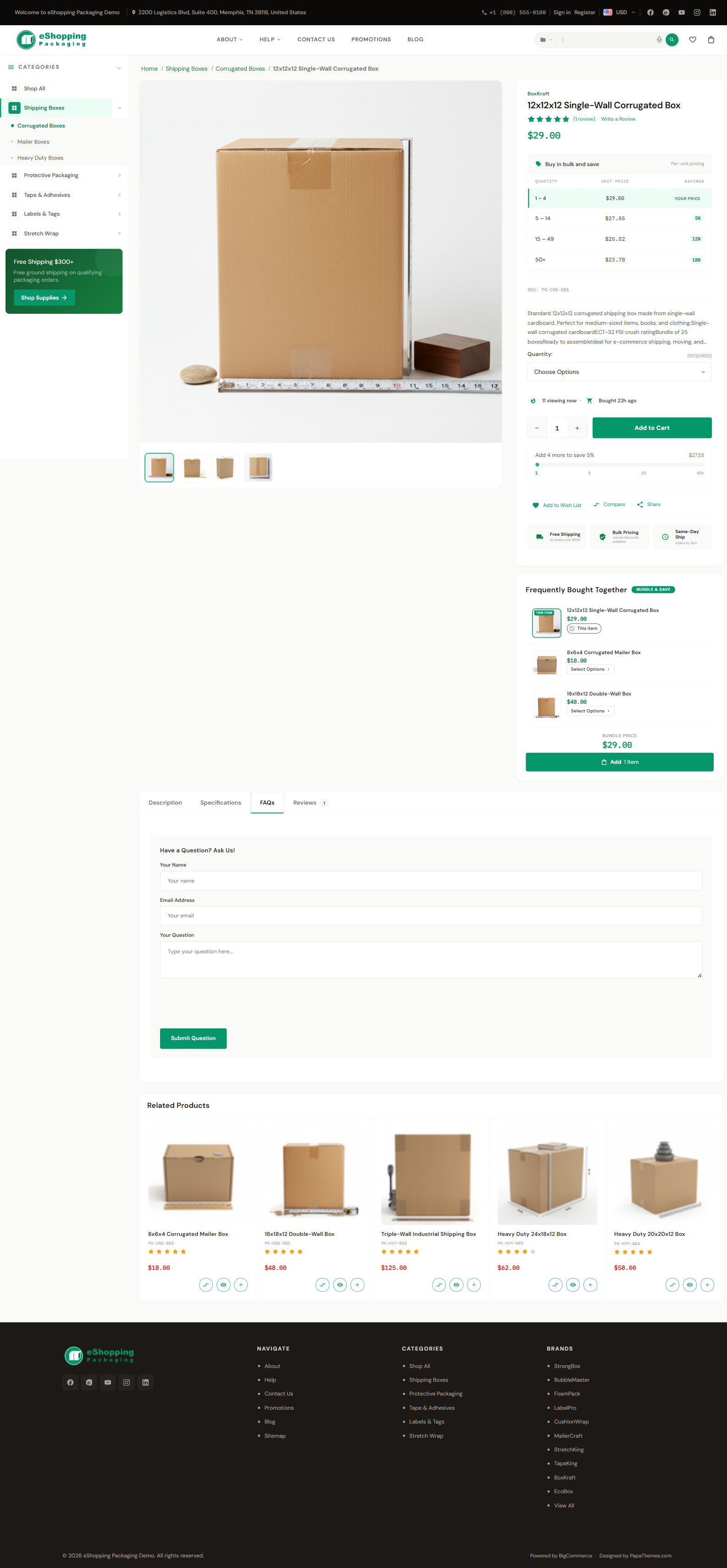
Image gallery
The gallery shows the main image with a horizontal thumbnail strip below it. There is one thumbnail per uploaded product image, so the strip grows with the number of photos you add. Click the main image for a fullscreen lightbox with zoom (scroll-wheel, double-tap, or pinch).
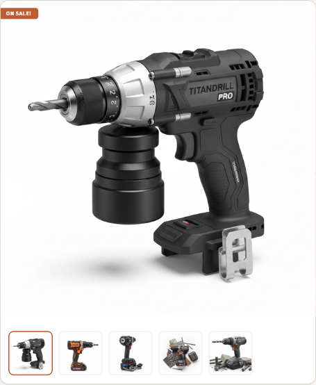
Image sizes
These settings tell the theme the maximum render size; BigCommerce downscales each uploaded photo to fit.
Always upload large, square images
Upload high-resolution square PNG/JPG (e.g. 1500×1500). BigCommerce can downscale for thumbnails and product cards but cannot upscale. A square shape avoids cropping surprises across the gallery and card layouts.
Videos
Product videos are YouTube videos, not uploaded files. Add them in Catalog → Products → (product) → Videos by pasting a YouTube URL (or video ID). They do not appear inside the image gallery — they render in the dedicated Videos tab below the gallery (see Tabs).
Title, brand, SKU, rating
These come straight from the product record (Catalog → Products → edit). Brand is shown only if you've assigned one. Rating shows the average of all approved reviews.
Weight is gated in two places — both must be on, and the value itself comes from the product record (Catalog → Products → product → Weight). Dimensions has no global toggle; it is theme-only.
First the store-wide switch in BigCommerce admin → Settings → Product Settings:
Then eShopping's own display checkboxes:
Price + sale badges

eShopping shows:
- Sale price (or regular if no sale) in the Terra colour
- Original price struck-through to the right (only if on sale)
- Sale badge as a coloured pill on the image (see below)
When you set an MSRP / retail price on the product, the theme shows it struck-through with an automatic "You save $X" amount (the difference between the retail price and the selling price). You can override the retail-price label with the Product price label (retail) text setting (id pdp-retail-price-label, default empty → uses the built-in label) under Theme Editor → Products → Product sale badges.
Staff Pick badge colour
eShopping renders a Staff Pick badge on certain product cards. There is no merchant-facing toggle to enable it per product and no custom-badge value field — only the styling is controlled, by two colour pickers in the eShopping Theme section:
Variants — swatches
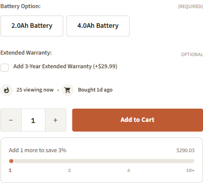
Color / size variants appear as swatches if you've set them up in Catalog → Product Options & SKUs:
- Color swatches — for option type "Swatch (Color)". The theme renders them as colour circles.
- Image swatches — for option type "Swatch (Image)". The theme renders the option image.
- Rectangle text swatches — for "Rectangle list" options (size: S / M / L). Rendered as text pills.
The swatch sizes shown are styled by the theme. The only configurable image dimension is Product swatch images (id swatch_option_size, default 22x22) under Theme Editor → Products → Image sizes, which controls the source resolution of image swatches.
To show swatch names beside the swatch (e.g. "Black" next to a black swatch), check Show product swatch names (id show_product_swatch_names) in the Products panel.
Add to Cart + sticky mobile ATC
The Add to Cart button is always visible on desktop. On mobile, when the user scrolls past it, a sticky bottom bar appears with price + ATC.
Toggle the mobile sticky ATC:
Quick payment buttons
When BigCommerce's express-checkout providers (PayPal, Apple Pay, etc.) are enabled in your store, the theme can render their quick-payment buttons beneath Add to Cart.
Compare
The Add to compare control lets shoppers queue products into a compare panel.
Shipping text + Warranty text
These are two separate settings in the eShopping Theme section, under the Product Page (PDP) heading, and they appear in different places.
PDP Shipping Text (id eshopping-pdp-shipping-text) produces the 3-item icon strip shown under the Add-to-Cart button. It is a single field made of exactly three Title|Description pairs (6 pipe-separated segments — Title1|Desc1|Title2|Desc2|Title3|Desc3). The strip always renders three fixed icon cards (truck, shield, clock); extra segments are ignored.

Free Shipping|on orders over $500|1-Year Warranty|included with purchase|30-Day Returns|hassle-free policy
Plain text only — HTML and links are not supported (each segment is inserted as plain text via textContent). The strip is hidden entirely if the field is empty.
PDP Warranty Text (id eshopping-pdp-warranty-text) is a separate field that fills the 4-card grid inside the Warranty tab (not the strip under the ATC). It is made of exactly four Title|Description pairs (8 pipe segments). The grid always renders four fixed cards.
Tabs (Description · Videos · Specs · Warranty · FAQ · Reviews)
The FAQ tab is toggled separately in the eShopping Theme section with the Show FAQ Tab setting (a built-in ask-a-question form — see Product FAQ).
The Warranty tab is rendered automatically when the product has warranty text (Catalog → Products → edit → Warranty Information). Inside the warranty tab the theme shows a 4-card grid of warranty highlights (set the four title/description pairs in the PDP Warranty Text field — id eshopping-pdp-warranty-text, in the eShopping Theme section under Product Page (PDP)), plus an area below the cards where you can drop a widget — either on every product (region product_below_warranty--global) or on one specific product (region product_below_warranty).
.papathemes-ai-widget-… { … }
…your HTML…
</style>
The Videos tab is rendered automatically when the product has videos uploaded.
Adding "Shipping & Returns" or other content to every PDP
eShopping provides a widget area that renders BELOW the tabs (not inside them) on every PDP. Drop any HTML / Accordion / Banner widget there. There's also a matching area for content on a single product.
Customizing the Specifications tab label
Use the Product custom fields tab label text setting (id pdp-custom-fields-tab-label) to override the tab title. Leave it empty to use the default ("Specifications").
Frequently Bought Together (FBT)
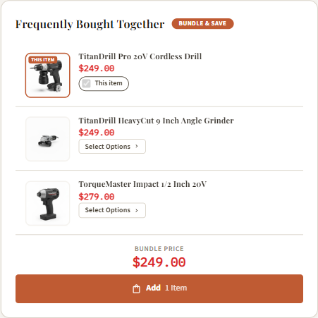
A bundle widget that appears above the tab strip (between the image/info section and the tabs), showing the current product + 1–3 frequently-paired products with an optional bundle discount. See full guide: Frequently Bought Together.
Related products
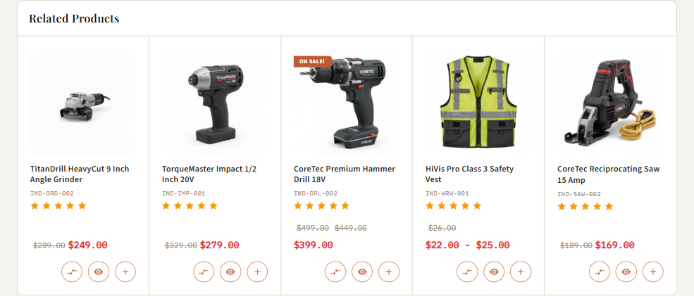
Below the tabs the PDP shows a single Related products slider. Related products come from the product's Related Products list in BigCommerce — automatic (by category) by default, or manually curated per product in Catalog → Products. The slider only renders when the product has related products.
Customers Also Viewed
The theme also has a Customers Also Viewed module, controlled by the Product page (customers also viewed products) count (id productpage_similar_by_views_count). When a product has no related products, the PDP falls back to the standard tab layout, where this module appears as a "Customers Also Viewed" carousel.
Cross-sell is a cart feature
Cross-sell products are shown in the cart / cart drawer, not on the PDP — controlled by the Cross-sell products (page,drawer — 0 = off) field (id eshopping-crosssell-count, default 6,4) under Theme Editor → eShopping Theme → Cart Cross-sell. The value is two numbers page,drawer (count on the cart page, count in the cart drawer). There is no recently-viewed slider on the product page (Customers Also Viewed is based on view behaviour, not the visitor's own recent history).
Urgency strips

Two short message strips that build social proof. Configure them in the eShopping Theme section, under the Urgency Signals (Social Proof) heading:
The last-order message adapts its units automatically — it can read as minutes, hours, or days ago depending on the random value.
These are randomized client-side per session — they're not tracked analytics.
Quick view button
The product card in sliders + category grids has a Quick View button. Clicking it opens a modal showing the PDP without leaving the page. Toggle it in Theme Editor → Products → Display settings:
- Show quickview button on product cards (id
show_product_quick_view)
Stock availability & rating bars (automatic)
- Stock badge / availability message comes straight from the product record — BigCommerce admin → Catalog → Products → (product) → Inventory (stock level, "Stock Level Display") and the availability text. (Not a theme setting; there is no Theme Editor toggle for the PDP availability line.)
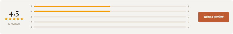
- Review rating bars (the 5-star breakdown in the Reviews tab) are rendered automatically from the product's approved reviews — no setting. Reviews are managed in BigCommerce admin → Products → Product Reviews. The Reviews tab and its count are gated by Show product reviews / Number of product reviews (see Tabs).
Product page settings in the demo stores
All four demo stores (Industrial, Auto Parts, Electronics, Packaging) use the same PDP configuration. The only thing that differs between them is the copy in the shipping/warranty fields:
Each store fills its own PDP Shipping Text (eshopping-pdp-shipping-text) and PDP Warranty Text (eshopping-pdp-warranty-text) with industry-appropriate copy (e.g. Auto Parts uses a "Fitment Guarantee", Packaging uses "Bulk Pricing" / "Same-Day Ship"), but the structural settings above are identical. See the per-block defaults in How to customize each section above.